Sunday, 23 March 2008

Epson 4800 / 4000 inkjet printer SSCL nozzle cleaning mode

Recently on the Yahoo Epson 4000/4800/4880 Support Group forum a powerful nozzle cleaning mode was highlighted. This is the SSCL mode – Epson call this “Super Strong Cleaning” and others call it “Super Sonic Cleaning”. In any case it is an interesting additional cleaning mode.


The SSCL is mentioned in the Maintenance section of the Epson 4800 user guide – I have made screenshots of the instructions (pages 117 & 118 in my pdf version of the user guide) and amalgamated them into one image giving the instructions of how to run a SSCL cycle (they are the same for the 4000):
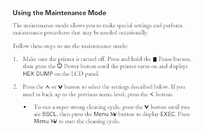
Click on the image to see it full sized

This Maintenance Mode is also called Maintenance Mode 1 in the field repair guides.

Epson describe the SSCL cycle as “Ultrasonic” head cleaning and is so powerful that Epson limit its use to 251 times in the life of the printer.

There seems to be some debate about how much ink this cleaning cycle uses, with some saying they have used it successfully and used no ink to others who say it uses about 100ml on ink for a complete cycle.

Personally, despite my continued problems with nozzle colour loss (I no longer think of it as nozzle clogging as it is not usually a few nozzles missing, but the complete colour – to me all the 180 nozzles per colour channel going missing at once points to a different mechanism than nozzle clogging caused by ink deposits on the nozzle, drying out etc, but that is another story) I have never used this cleaning cycle, nor in fact the Power Cleaning cycle.

Epson has a hierarchy of cleaning cycles to produce progressively more powerful cleaning effects; each one taking longer and using more ink. In Epson’s 4800 field repair guide they list the following cleaning cycle’s under Maintenance Mode 3 (the 4000 only has two Maintenance Modes listed in its field repair guide):
Std. KK0 (Weakest cleaning cycle (uses less ink))
Std. KK1 (Medium strength cleaning cycle)
Std. KK2 (Stronger cleaning cycle)
Std. KK3 (Strongest cleaning cycle)
Init. Fill (Forces a initial fill (prime))
Maintenance Mode 3 can be activated by the following routine:
Turn the printer off
Press and hold the Pause, Down, and Right buttons and turn on the Printer
In Epson’s 4800 user guide they say that to run a Power Cleaning cycle you have to have at least 50% full cartridges, implying it uses a lot of ink. I have seen some Forum postings say that the SSCL cycle uses less ink than the Power Clean…

Now it is my guess that the SSCL is either the KK3 cycle (in the 4000 field repair guide Epson only go as far as the KK2 cycle) or a stronger one still; but in any case I think it will use a lot of ink and is really only to be used as a truly last resort before calling in a technician if your print head has truly clogged nozzles – eg completely dried out, clogged with chemical deposits etc.

These cleaning functions can be found under Maintenance Mode 2 on the 4000 (the same works for the 4800), which can be activated by the following routine:
Turn printer off
Press and hold the Left, Down, and Up buttons and turn on the Printer
Turning off the 4000 Maintenance Tank counter
This routine also finds the 4800’s Maintenance Mode 2, but it has a different set of parameters to the 4000. Interestingly I note that it is possible to turn off the Maintenance Tank’s counter in Mode 2 on the 4000, but I can’t find it as an option anywhere for the 4800.

All-in-all well worth knowing about the SSCL, but if anyone knows more about it please let me know by leaving a comment on this posting.
Read more...

Tuesday, 18 March 2008

Running Lightroom on two computers with the same catalog

When I decided to commit to Lightroom I also effectively committed myself to keywording my initial library of 6,000 photos and to keyword new images as I created them. This was not going to happen overnight and I quickly realised that I was going to want to work on them on more than one computer - Would this mean that I needed to buy a second copy of Lightroom and was it technically possible?


First why exactly do I need to work on more than one computer? Well, my primary computer for working on images is a reasonably specified desktop PC with a largish LCD calibrated monitor, Wacom graphics tablet and sundry attached devices. But this is in my office and I often found myself wanting to be less anti-social and able to work on a laptop just entering the keywords and doing general image management.

First off I was not willing to buy a second copy of Lightroom for this, but I did discover in one of my initial Lightroom learning sources that it was legal to have two copies installed with one purchase. To confirm this I looked up Adobe’s web site and found the following definitive statement in their Lightroom FAQs:

“How many computers are covered by a single license of Photoshop Lightroom 1.1?
Subject to the terms of the End User Licensing Agreement, the primary user of the computer on which Photohop Lightroom (the “Software”) is installed may install a second copy of the Software for his or her exclusive use on either a portable computer or a computer located at his or her home, provided that the Software on the portable or home computer is not used at the same time as the Software on the primary computer. You may be required to contact Adobe in order to make a second copy. Photoshop Lightroom is sold as multi-platform software, which means it can be installed on either Mac OS X or Windows.”
Unless Adobe read this posting and correct their spelling of Photohop (sic) in this FAQ that is how they spell it…

More seriously this clearly says that running two copies on different computers is legal and since I can find no reference to this being changed for v1.3 I assume it still is, and I sincerely hope it remains so.

So is it technically possible? Simply – Yes, and it is easy to do. Since Lightroom does not need access to the original full size image files to work on things like keywording; it only needs access to the previews Lightroom automatically generates when it imports the images in the first place you only need to have the catalog and previews available to work on them. Only if you want to process the images (e.g. create TIFF files from RAW etc) does Lightroom need access to the original file.

Here’s how I did it:
  1. I bought a USB powered 120Gb LaCie Rugged external hard drive (see photo below) – I wanted it to be USB powered as it would be much easier to move it around without the power brick to power it. I forced the drive letter to “Y” so that I will not get confused with any other drive I might have installed temporarily.


  2. I had originally installed Lightroom with its default settings and have so far only worked with one catalog. I had also set it to prompt for backup every time it starts up. This makes a backup copy of the current catalog and stores it wherever you want it stored (in my case the default “My Pictures” folder). I found the copy of the catalog on my desktop’s internal hard drive in the default location: “Program Files=>Adobe=>Adobe Photoshop Lightroom 1.3”. I copied this up to my normal backup external hard drive in case of accidents. With the frequent backups that I had made already this was not really necessary, but I really, really did not want to lose the work I had done so far, so a belt & braces approach seemed the best bet.

  3. I then instructed Lightroom to export a copy of the catalog to the LaCie (Y:) drive. Since to use the catalog you also need the previews I ticked the box to include them with the export (circled in the screenshot below).

    If you want to see a full size view of any of the
    screenshots just click on the image

  4. I then (with everything crossed) deleted the original Catalog and previews from the internal drive.

  5. I then started up Lightroom, skipping the backup option on start-up. The screen below popped up (this is actually the screen I get when I unplug the LaCie drive with the catalog on it, but the principle is the same). I chose the “Select Catalog” option (circled) and navigated it to the new copy of the catalog on the LaCie drive. Lightroom then started up as if nothing had happened.


    Currently there are 6,703 files in the Lightroom folder on the LaCie drive for 6,695 images – 6,701 of them are catalog previews, taking up 7.3Gb of space. The single “Lightroom Catalog” file is 90.1Mb.

  6. I then installed a second copy of Lightroom on to a laptop. When it started up there were (not surprisingly) no photographs. I plugged in the LaCie drive and told Lightroom to "Open Catalog" (Ctrl+O); I navigated to the catalog on the LaCie drive. Lightroom then re-launched itself using the new Catalog, et voilĂ , it worked…

    As you can see in the screenshot below the previews, keywords (circled in screenshot) and other metadata are all there. The only real difference is that there is a "?" in the top right hand corner of each thumbnail (circled in screenshot) which is Lightroom telling you that it can not find the original image file; again not surprising as they are not on the laptop anywhere.


It really was very easy, although worrying. Using the two machines has been easy and so far I have not experienced any problems. I still have quite a lot of keywording to do though…

I have continued to backup the catalog on the internal hard discs of each machine every time I start Lightroom, so that I now have multiple backups of the catalog. Every now and then I delete old catalog backups as I can not see any reason to keep them beyond a few versions and each backup is the same size as the current catalog (around 90Mb each time at the moment).

I have not noticed any performance degradation with the catalog and previews on the external drive instead of the internal one – I am very happy with the set up.
Read more...

Wednesday, 12 March 2008

Comparing image printing through Lightroom and Qimage

This posting compares my experience with photo image printing through both Lightroom (v1.3.1) and Qimage Pro (v 2008.205). I have been using Lightroom for 3 months and Qimage for 2½ years. Since Qimage is only available for the PC this review will only cover PC related experience.


Much has been written about Adobe’s Lightroom since its launch around a year ago so I will not give any further background to that – there are plenty of sources and I have listed some in an earlier posting.

Qimage is a much less well known fully ICC colour managed workflow PC based printing application, although it does more than just printing - full details may be found on Qimage’s website. Over the years that I have used Qimage I have essentially used it as my primary image printing software, having got frustrated with Photoshop’s printing interface, and not used its other features much at all – so this review will concentrate solely on image printing.

Essentially Qimage optimises the printer’s own driver, thus replicating many of the advantages of Raster Image Processing (RIP) software, but at a fraction of the price in a package that will work with any printer, unlike RIPs which are printer dependent. Since it uses the printer’s driver it is limited by that – for instance the driver for my Epson 4800 Pro inkjet printer insists on having a 14mm margin at the bottom of every sheet printed; Qimage can not do anything about that.

For me the main attraction of Qimage is that with its built-in sophisticated image resampling and sharpening algorithms it enables me to very easily print an image at any size I like from A2 down to passport photo size without having to do anything to the original image file – the software does all that is needed and it is extremely easy and quick to use. I can simply create on optimised TIFF or JPEG file from a RAW capture and use Qimage to print it at any size my printer can manage. Clearly it can not create miracles – it will not produce high quality A2 prints from a 100k file, but it will do the best possible job of any software that I can afford. I have made A2 prints good enough to hang on the wall from my Canon 10D’s (6.3 megapixel) and 30D’s (8.2 megapixel) RAW files. Qimage also allows me complete control of what size and where I print images on the page or roll.

Qimage comes in three versions; Lite, Pro and Studio at $34.95, $49.95 and $89.95 respectively, and all versions come with free unlimited lifetime upgrades. You can also upgrade to a higher version at any time. There is also a 30 day free demo version available from the website.

While Qimage claims to be Vista compliant this review will only cover Qimage Pro using Windows XP SP2.

In this review I shall pick out particular features and areas that I routinely use, and compare them in Qimage and Lightroom – it is thus not a complete review, and in some cases my observations may be tainted by ignorance, but after years and months of use and a good deal of research, reading and (I would like to feel that it has been intelligent) trial and error I feel that any ignorance is likely to be as much due to lack of usability, poor documentation or simply poor implementation as my stupidity.

Since my main reason for using Qimage in the first place was to be able to easily make quality prints of images at any size I choose that is where I will start.

Print Quality

I have printed identical colour and B&W images on my Epson 4800 Pro inkjet printer through both applications at all sizes up to A3+ on a range of gloss papers using bespoke profiles, generic profiles and built in printer profiles.

This first thing to say is that since both packages are fully ICC colour managed there is no difference I can see in colour rendition in any cases.

At print sizes below A4 no one has noticed any significant difference between the output from the two packages. At A4 and above, however, there is a clearly discernible quality advantage in Qimage printed output over that from Lightroom, with the advantage becoming larger as the print size increases. The images look sharper and in photos taken with my Canon G9 where there is more image noise discernible in flat areas of colour, such as blue skies, from prints via Lightroom; from Qimage the noise is smoother and less pronounced. While not hugely different at typical viewing distances Qimage definitely has the edge in my experience.

Printing specific sizes

Being able to quickly make a print of a photo at any desired size without having to go into Photoshop (or any other application such as Genuine Fractals) to re-size it and print it off is a major time and tedium saver. Both Lightroom and Qimage offer this feature, but Qimage’s implementation of it is more precise and less prone to error than Lightroom’s.

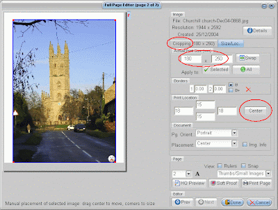
In Qimage you simply choose the image dimensions you want, either from presets or through a custom dialogue, see the screenshot below – in this case I have set 180 x 250mm, which shows up in the dimensions box circled in the screenshot. This is exactly what I get when I print it. Since to produce the print at that size Qimage needs to crop to left and/or right you can set it to do it automatically or fine tune it using the crop tab (circled on the screenshot). Also to centre the print in the page you can just hit the “Center” button (circled on the screenshot) and it sets it to as near the centre of the page as it can.

Click on the screenshot to see it at full size

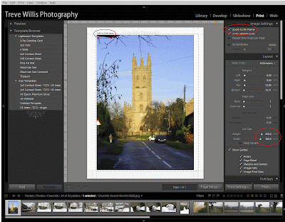
In Lightroom if there is a preset with what you want already set up then it is pretty quick, but if you want to make a print outside of a preset size then you do it by setting the cell size. In the screenshot you can see that I have set a cell size of 180 x 250mm (circled in the screenshot), but what I actually get is 180 x 240mm or with “zoom to fill frame” ticked it tells me I am going to get 187 x 250mm (circled in the screenshot). This caused me no end of angst while I tried lots of things to get it to say 180 x 250mm, until I just printed it to see what I got and found that it actually printed 180 x 250mm – all quite confusing and, although OK’ish in the end, it did not inspire confidence. I think that the displayed sizes are actually the size of the uncropped image – so in the case above I think that it may be telling me that the uncropped image is 187mm wide, but I have not found this documented anywhere (if it is in the Lightroom help system then I have not had the patience to find it yet).


To centre the image on the paper you have to set the margins manually, which is not nearly as convenient as Qimage. If Lightroom needs to crop the image to produce the dimensions then you can move the image in the guides to optimise the image, which is quicker to do in Lightroom than Qimage.

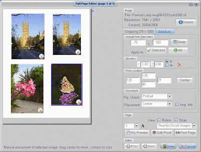
If you want to print several images all of different dimensions on a single sheet then it is only possible in Qimage. The screenshot below shows four images, each with exact and different dimensions, set out on the screen as they will print. In Lightroom all the prints have to be the same size.


So, although both packages produce the print of the right dimensions in the end I find it easier to do in Qimage, and if you want variable exact sizes on a single page this is only possible in Qimage.

Contact printing
I often want to print contact sheets (either to paper or pdf files) to make selections of which images to work on and, I since I nearly always shoot in RAW capture mode, I normally want to make contact prints direct from RAW files. I can not do this in Qimage Pro (although the Studio version may be able to as it deals with RAW files) so I have always done this in my file browser, which is Breezebrowser Pro. This, however, limits me to printing the as captured images. Lightroom does print contact sheets – I have found it really easy to do this, and it is especially helpful that it will allow me to make some basic adjustments, crops etc to the files and add the needed image information to each one before printing. This is quick to do in Lightroom’s workflow and makes a much better starting point to make decisions on which images to optimise. I really like this and Lightroom wins this function hands down.

Layout flexibility

As already discussed Qimage is more flexible in layout than Lightroom; but it is more flexible still. You can drag images around the page manually, automatically disperse them around the page, evenly or compacted, although all the pages in a print run have to be managed the same way. If you ask it to, Qimage will sort through the images in the print queue, re-ordering and rotating them to minimise paper usage. Lightroom does not offer anything like this.

Presets and History

Saving common jobs etc is a real time saver and both Lightroom and Qimage offer the feature, called “Presets” in Lightroom and “Save” and “Recall” in Qimage. Saving printer settings is also a huge time and paper saver – once you have optimised printer settings, such as ICC profiles, printer driver and page settings etc it is much easier to recall them and switch between page sizes and papers than having to enter all the details each time as you have to do with Photoshop. I would really be lost without this feature in a printing application.

I find that Lightroom’s implementation of its version is easier to use than Qimage’s, but Qimage offers more options to save; most interesting to me is the ability to save whole jobs – including printer settings and the files to be printed – which can be recalled at any time. I find this really useful for repeating jobs or setting up jobs to be printed at some future date. You can set up print jobs off line and then print them when convenient. This is especially useful to me as I have an ongoing battle with my Epson 4800 (see my Epson 4800 blog postings) to keep it working and it is much better to batch up photos to print than do them piecemeal. Lightroom does not offer the ability to save any file information in Presets, so you will have to select the files to be printed under a Preset action every time you use it.

Lightroom does not offer a history state of print jobs, but Qimage does. It has an automated job log feature which can be set to hold the last 100 jobs, all or none of them – I set mine to keep all jobs. Again I find this very useful when wanting to reprint a particular job or recall what settings I used for a specific print.

Both applications save these “remembered” settings in separate discrete files so they can be backed up, and in theory exchanged, although I have only seen evidence of a preset exchange community appearing in Lightroom; and this is predominantly for non-printing effects such as B&W conversions etc.

So here Qimage beats Lightroom on nearly all fronts, although Lightroom’s user interface is easier to use.

Price

Comparing price is not easy as Lightroom is much more than a print module – so call it evens here. But Qimage is always being updated, as I am sure Lightroom will be, but Qimage upgrades will always be free, whereas I suspect that Adobe will come back for more at regular intervals.

General comments
  • Lightroom does not seem to have the option for recording whether Black Point Compensation (BPC) is set or not. While this has not been a problem I nearly always turn it on in Photoshop and Qimage, and am a bit puzzled by its lack in Lightroom.

  • Lightroom has a file size limit of 10,000 pixels on a edge. I have seven files that exceed this limit, mostly panoramas and so not only can I not add them to the Lightroom database I can not print them either. Although Photoshop has no problem with them Qimage is really the only option for me and it quite happily prints panoramas of around 400 mm wide x 1200 mm long on roll paper.

  • As I have already mentioned Lightroom will print directly from RAW files whereas Qimage Pro will not. I find this very useful for every day printing; it saves a lot of time and space not having to convert to TIFFs or JPEGs for many of the files I print.

  • Both applications provide the ability to add file information, cropping marks and text to prints. Simply ticking the appropriate tick box to add the required feature works similarly in both, although Qimage does offer many more options for all these functions. Lightroom has its specific implementation of its “Identity Plate” – which puts a pre-prepared (but users can edit it) photographer’s ID or © notice anywhere in the printable area (including on the image) or on each image on the page. This is usefully editable with size, opacity, colour and angle (although only ±90° & 180°) and the position can be dragged around the page manually unless you are rendering it on each image, in which case it always goes in the middle of each image. You can do the same with Qimage via its “Add floating text” function. This is much more flexible than Lightroom with any angle, font, size, colour or position you are likely to want available. This can be used to add multiple text entries on the page, all different. You will, however, have to add in the text separately for every image printed and there is no option to print an identity plate on every image (although this feature may be hidden in Qimage’s associative filters etc, and despite looking for it I have not been able to find out definitively whether this is an option or not). In Lightroom you can also add custom text in the “Photo info” option, but this always prints at the bottom of the image and is pretty limited in what it can do.

    Qimage offers much more flexibility for ultimate control of these additions to the printed image, but it is finicky to do and Lightroom’s user interface is much easier to use. So the choice here is ease of use versus power. They both have their place and I use both as needed.

  • Which brings me onto the user interface and features. I really like the ease with which you can reconfigure the on-screen display at a keystroke in Lightroom, bringing up and hiding menus and options with speed and ease. Qimage uses a less sophisticated user interface. All the panels show all the time, although they can be dragged to difference sizes – In most applications I use keyboard shortcuts quite a lot, but not in Qimage. There are very few keyboard short cuts in Qimage for the features I use most, so they generally have to be accessed via drop down menus, and/or buttons or right-clicks on the mouse. I find that most of the keyboard short cuts are for things I do not use very often so I never remember them. It all seems to take longer to do in Qimage, although in nearly all cases the feature set each action offers is more complete than Lightroom’s. In my mind there is no doubt that Lightroom’s user interface is much more intuitive than Qimage’s and hence easier to learn and quicker to navigate around in use. So for ease of use Lightroom wins out; for features available Qimage wins.

  • Lightroom works in the background, whereas Qimage does not – so when a print job is running in Qimage you will have to wait or go and do something else – you can browse images, but not do anything with them until the job is finished. I have not, however, found this to be too much of a problem as it is usually reasonably quick in rendering the print files and sending them to the printer.

  • Both applications offer border printing, but Qimages’s is more flexible and I find easier to use. Lightroom allows you to set the border colour and width, but the width is set in points (pt) and I think in “mm”. Qimage offers the option to set one or two borders, either inside the print dimensions you have set or outside of them; they can both be different colours and are set in mm – all-in-all a more flexible implementation than Lightroom.

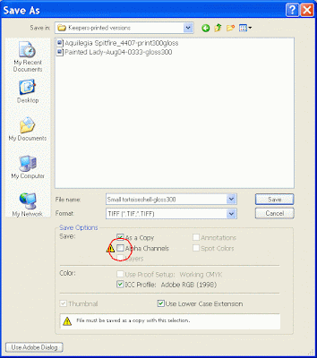
  • As already mentioned I can only meaningfully view TIFFs or JPEGs in Qimage Pro – not RAWs. Qimage also will not work with TIFFs with Alpha channels (e.g. channel copies made in Photoshop) saved with the file. To be able to view and print these you will have to untick the “Alpha Channels” box in Photoshop’s save dialogue box, circled in the screenshot below.

  • It is much easier to select files to print in Lightroom – this is not surprising as this is what Lightroom is all about – finding and working with image files. In Qimage you have to navigate to the individual files and add them to the queue; with Lightroom you can use any of the methods to find the files you want and add them to the print queue by selecting them.

  • Both applications have cropping options, but I have found Lightroom’s much more intuitive and powerful to use; it also allows image straightening to improve horizons etc within the develop module, which Qimage does not. So, for creative cropping, Lightroom wins this round of the contest.

  • Several times I have sent emails to Qimage’s Tech Support (Qimage’s developers DDI software to be exact) – each time I have received a reply within a day or two, which across time zones (I am in the UK, DDI tech support I presume is in the US somewhere) is pretty good and much better than most enquires I have made to other application providers’ Tech Support teams. I each case they have also solved my problem (such as the alpha channel problem).

  • Learning resources for both packages: Qimage offer reasonably full tutorial support to learn Qimage; there is also a forum to help users and various reviews around the web, but undoubtedly Lightroom has much more of a user community support base. There are dozens of forums dedicated to it and books written about it, all sorts of power users offering their ideas etc etc, but without DDI’s good Tech support it would often have been nearly impossible for me to solve some issues. While Adobe does not offer the level of service that Qimage offers there is so much “out there” that finding solutions should be relatively efficient and there is a growing Preset community growing. I also understand that further enhancements such as Pixel Genius’ PhotoKit Sharpener package may be available to use in Lightroom as some sort of plug-in in the not too distant future.

Conclusions
So will I keep on using Qimage? Simply – Yes.

When I want to make the best possible print for display etc I will print through Qimage; especially anything above A3. For everyday ease of use Lightroom wins out, but Qimage ultimately has the more powerful feature set and produces the better results.

Lightroom has certainly replaced Breezebrowser Pro as my route for producing contact prints and I will use it for small or non-critical prints and proofing. If I want to make optimum use of paper, print panoramas, print out lots of differing exactly sized images or add in more text on the printed page than Lightroom allows I shall use Qimage.

Hopefully both will continue to improve and I look forward to the options that will become available - perhaps even a Qimage plug-in for Lightroom someday?
Read more...

Saturday, 8 March 2008

Reusing Epson 4800 Pro inkjet printer maintenance tank

When I first bought my Epson 4800 I was warned by a dealer that there was a chip on the maintenance tank and that the printer would stop working when it reached 0%, regardless of whether there was any space left in the tank. Instead of keeping a spare in stock I resolved to reuse the tank as a small contribution to not wasting the world’s resources.


The maintenance tank is the drawer in the bottom right hand corner of the printer, just below the right hand bank of ink cartridges. Its only purpose (that I can determine) is to catch the ink that is expelled from the system when the machine does nozzle cleans or purges the lines during changeovers between photo and matt inks etc, and to catch any overflow from puddle cleaning. It is simply an oblong plastic tank, filled with absorbent material covered with a removable plastic grid; and it also has a chip on it which the printer uses to keep track of how much it thinks it has filled the tank up. When it reaches 0% you need a new tank or the printer stops working, regardless of whether everything else is fine – or so I am lead to believe as I have never run it down to 0%.

Now I resent having to pay out £20 or more for the privilege of pouring expensive ink into a tank which could easily be reused, but Epson decree should be thrown away, so I decided to find a way round the system and reuse the tank.

Since I had no idea when I bought the printer how long the tank would take to fill and I had noticed that some suppliers quite often ran out of spare tanks I decided to buy a chip re-setter to make sure that I could carry on printing if need be. The easiest place for me get one was on eBay.

I reset the chip when it arrived just to check that it worked and it did. I then reset the chip when the tank was about 75% full and recently decided to reuse the tank properly. I figured that all I needed to do was take off the grid, remove and throw away the ink soaked absorbent material in the tank and replace it with something else absorbent – while I suspect that this is not strictly necessary as all that is needed is a tank to catch the ink I wanted to avoid splashes etc both during use and at changeover. After a bit of thought I decided that the easiest thing to use was nappy material, so I bought the cheapest I could find at the supermarket.

Tools and materials needed:
  • Pair of surgical gloves
  • Blunt small screwdriver
  • Chip re-setter
  • Ink tight waste disposal bag
  • Long nosed pliers
  • Clean up cloth
  • Newspaper
  • 3 nappies
The photo below shows the tank when it was taken out. I was expecting the ink to look black, but for some reason it was dark green.


Here is the process I used to refurbish and reuse the maintenance tank.
  1. First carefully prise off the plastic grid from the top of the tank using the blunt small screwdriver – it unclips at various points all around the tank.

  2. The absorbent material in the tank is tightly packed, so use the long nosed pliers to pull it out and dump it into the waste disposal bag.

  3. Clean around the inside of the tank to remove any unabsorbed ink and you should end up with an empty tank and a clean grid (see photo below).


  4. Then peel the (hopefully) waterproof outer off the nappies, otherwise the tank will not absorb much (I found that three roughly filled the tank without packing them in too tightly, but sizes will vary) and pack them into the tank. Finish off with a layer of the permeable inside of the nappy upper most in the tank – for neatness and to make sure that the nappy material does not go anywhere it shouldn’t.

  5. Clip back on the plastic grid (see photo below).


  6. Then use the chip re-setter to re-set the tank chip to 100% - in my case the spring loaded prongs need to be aligned with the contacts on the chip and gently pressed against the chip (see photo below). The LED on the top of the re-setter flashes red for a 3 or 4 seconds then turns green.


  7. Reinstall the tank into the printer.

This worked fine for me and took about half an hour the first time I tried it.
Read more...

Friday, 7 March 2008

Lowepro D-Pods 30 case for Canon G9 compact digital camera

Since I bought the Canon G9 I have been using an old HP calculator case (see photo below) to protect it when I’m on the move, but I have now finally received the case I planned to use; a Lowepro D-Pods 30 – this is my short review of it in use.


Description and specifications
The D-Pods 30 was designed by Lowepro for small digital cameras. It is made from a black stretchy, water-resistant fabric and weighs (without the shoulder strap) around 70g; it has a Velcro secured belt/SlipLock™ compatible loop on the back, a battery/accessory pocket on the front of the case and a memory card pocket in the inside of the front flap. You can also slip something under the memory card pocket (as shown in the photo below). It also comes with a removable shoulder strap and the table below lists the dimensions. In the UK it costs around £7.99.


Interior - Inches / cm
Exterior - Inches / cm
Height
4.9 / 12.5
5.4 / 13.8
Width
2.8 / 7.0
3.2 / 8.2
Depth
1.4 / 3.5
2.5 / 6.3


Lowepro D-Pods 30 case with Canon G9 in it, a spare battery in the front pocket, a spare SD card in the memory card pocket; also showing the extra slip in pocket behind the memory card pocket. The G9 has an Op/Tech Cam QD wrist strap fitted.


What is it like in use?
Well the good news is the G9 fits snugly into the pouch; it is a tight fit, but being stretchy it is easy to get the camera in and out. Being a tight fit, however, means that you can feel the shutter release button, dials and flash bracket on the top surface of the camera quite distinctly.

While you can fit a spare NB-2LH battery in the front pocket (as shown in the photograph) it does make the whole package rather bulky so I actually keep it in the bottom of the case, with the battery cover on, where it nestles in making the case more streamlined in use. Also having the battery in the front pocket makes it quite difficult to slip the camera in and out of the case – I found that I had to take the battery out, put the camera in and then put the battery in again.

The weight of the whole package in the photo above is 500g (1.1lbs).

A SD card fits neatly into the memory card pocket, which is made from stiffer material than the stretchy outer case. If, however, your camera takes Compact Flash (CF) cards then it might be worth knowing that the memory card pocket is not big enough to take a CF card. CF cards will slip in behind the memory card pocket, although it is not as secure as the proper pocket and might easily fall out. The front pocket takes a SD or CF card in a protective case quite securely.

I have not used the neck strap so have no comment to make on it other than it looks like the standard one that Lowepro supplies with most of its small cases.

Conclusion
All-in-all it is a pretty good choice for a Canon G9, being a snug fit it is no bulkier than it needs to be and gives good enough protection against accidental knocks and abrasion that occurs when these things rattle around inside bags, glove compartments and sundry other places day-in and day-out.

There is, however, no room for any much larger accessories such as a Lensmate, wide angle attachments or optical finder – for these you will need a bigger case.

I have now tried the D-Pods 30 with a Ricoh GX100 - click here to read the post.
Read more...

Monday, 3 March 2008

Eliet Minor garden shredder review

This is the final of the four reviews in this series on my experience with garden shredders and is a review of the semi-professional petrol driven Eliet Minor shredder.


Over the last couple of years our garden has produced more material than I have had the time to shred. I have been routinely having to spend most of a week-end shredding to keep up and getting grumpier about it by the month, but I was unwilling to throw away the organic material and our garden needed all the compost we could make, and more besides. We set up a rough bin (1.5m3) to hold unshredded material, but after six months that too was full. We needed an alternative solution, short of covering the garden in bins.

The photo below shows what I needed to deal with – the bin is about 1m high, and experience told me that it would take several days to shred most of it with the Lonos (assuming the patience of Job to actually stand there and do it), leaving much of the contents of the rough bin to rot down in its own time.


Just after Christmas I was watching a commercial shredder dealing with all comers’ Christmas trees – it was taking about 10 seconds a time, whereas I had just spent half an hour dealing with ours. I thought that there must be a mid-ground between my Lonos and the commercial one.

Initially I looked at renting one, but found the range available very small and limited, and the organisation and reliance on long range weather forecasts needed to plan to hire for a weekend (at between £150-£200 a time) too much. Also the ones for rent seemed most suited to tree chipping rather than the dealing with the range of stuff that I needed to deal with in our garden – from soft and mushy prunings to woody branches. No one could tell me whether theirs could manage the soft stuff I needed to shred.

I investigated further to see what it would cost to buy what I wanted, or to find out whether it even existed. First I looked for reviews etc… and found next to nothing. All I found was a Daily Telegraph review from 1999 of a Globe Garden Master, which at least said the extra money was worth it, but none for other similar types of machine. I found nothing useful on the web.

Looking around dealers I did not come up with many options, but one was all I needed. The most prevalent options seemed to be from a Belgium company I had not heard of before; Eliet (some dealers pronounced it “Elliot” and some “Elite”) along with Viking. The smallest petrol driven Eliet, the Primo, has just received a good review in the Daily Telegraph (January 2008).

There were others available on-line, such as Woodsman, Ardisam, Lawnflite, Masport and Echo Bear Cat, but no dealers seemed to stock them and I could not find any reviews. Nor were any of them available for test or hire. Globe Organic Services offered their Garden Master range along with a 10 minute DVD. Their design, however, looked archaic and they were only available from Globe direct. They did, however, explicitly say that it would cope with anything I was likely to put through it, came with a lifetime warranty and would do on-site demonstrations. They were, however, very big and heavy, and out of my price range to buy, with none for hire.

I realised that anything like this was going to be petrol driven so my quietness criteria for previous shredders was going to have to be dropped. Since I planned to use this machine well away from neighbours and for limited periods of time (or why else get a higher capacity machine at all?) I reasoned that the noise level could be managed and treated the same as using a petrol driven lawnmower – with consideration.

My rental/purchase criteria became:
  • Able to shred soft as well as hard material
  • Large input throat
  • High throughput per hour – at least 5x the Lonos 2
  • >40mm diameter shredding capacity
  • Possible for me alone to move around the garden
I was not particularly interested in a massive solid wood shredding capacity as I cut anything much over an inch in diameter to use as firewood.

I failed to find anything suitable to rent, but as luck would have it I managed to borrow a nearly new Eliet Minor (follow this link for details) equipped with a 6.5hp Briggs & Stratton Intek petrol 4 stroke engine (see photo above) – this uses unleaded petrol and being a 4 stroke it does not need any oil added to the fuel. The cheapest advertised price I have seen for one is £1,179 inc VAT & delivery (Feb 2008) + £68 for the multi purpose screen.

The Minor is part of a shredder/chipper range that is mostly focussed on the professional market, with the Minor slotting above the Chrono (a small electric shredder), Primo and Maestro, with four larger machines above it. It shows its professional heritage as there is no plastic to be seen on it apart from the odd knob and cover on the engine, and it is generally solidly engineered.

This review is my experience of using the Minor over about two weeks to shred woody cuttings, soft and hard prunings and most tricky of all the contents of our rough compost bin – which I discovered had started to compost down, but had a long way to go, and was wet, very fibrous and mostly chopped to about 30cm lengths. My estimate was that it would take several days and lots of blue language to get through it all with the Lonos 2 – which was never going to happen.

Eliet use a unique shredding design – their “Hatchet Principle™”. This means that all the material goes into a single wide mouthed inlet and is fed through a fearsome set of rapidly rotating angled blades – in the Minor’s case 12 blades rotating at 2,000rpm – and out through a screen onto the ground (see diagram below). Eliet claim that their machines can handle pretty much any type of organic material within the machine’s capacity – needing an optional multi-purpose screen if you are going to shred much “mushy” material. So although the max diameter of the Minor is 45mm the inlet is 220 x 300mm so that it is easy to feed bunches of prunings into it all at once as well as crooked and knotty material – so the pre-shredding preparation is absolutely minimal. The throughput was quoted as 16 wheelbarrows per hour, or about 1.6m3 per hour.

What was it like to use?
The picture below shows the first lot of shredding I did. It was all the material in the picture at the top of the blog except that actually in the bin. It took 30 mins and I measured it out at 10x 40l tubs worth, which makes it about 7x quicker than the Lonos 2. In reality, though, it was quicker than that. It would have taken much longer with the Lonos as I would have had to prepare nearly all of this material much more carefully - taking much longer and making it much more tedious. The time test I ran with the Lonos (1 tub in 20 mins) was using ideal material for it – this batch was far from that.


I found that the actual throughput with this machine was governed by the rate at which I could get material to it rather than the rate at which it could shred it – hence the discrepancy between the rated throughput of 1.6m3 per hour against my measured rate of half that at 0.8m3 per hour. This was exactly the state that I was trying to achieve.

It made light work of whole lavender bushes, including roots, Buddleia prunings, Phormium leaves (which nearly all shredders hate), climbing rose branches, dry ornamental grass stems, holly – mostly woody material with some soft things like bulbs and dahlia tubers mixed in. I tried all sorts of things, including a rotting mango with its large seed and it essentially disappeared – I could find no trace of it in the pile of shreddings; normally with the Lonos the seed chunks are quite identifiable in the compost months later.

Next I tried putting through the much wetter material from the bin. This did rapidly block up the 20mm exit holes of the standard screen, forming a thick paste on the inside of the screen. While this was quick and easy to clear (just lift the outlet guard, pull out a pin and the screen drops for cleaning) it would have been quite tedious to keep having to do it and I did not have enough woody material to make it unnecessary by mixing the two types. Luckily the machine came with the optional screen designed for these circumstances… You can see it sitting on the top of the machine in the picture at the top of the posting.

Changing the screens over the first time, however, was not a quick process. I was initially convinced that it was the wrong one as it took some persuading to get into place. Once in place I explored the boundaries of use of the shredder and I did manage to block it up by feeding too much of some really wet and mucky, fibrous material into the shredder– not really the sort of thing I would normally try. I found that with a judicious mix of really wet (from the middle of the rough compost bin) and quite dry (from the edges of the bin) material I could just put it in the hopper and prod it down the chute with a pushing stick. The photo below shows the output – it is pretty course, but much better than I would get any other way. I also put through armfuls of Periwinkle with their (small) root balls, which it chewed up quite happily. All-in-all a pretty good performance, but I would not want to be swapping between screens too often, although I am sure it would become easier with familiarity.


The photos below compare the shreddings from the Minor, with the 20mm standard screen in place, and the Lonos 2 – as you can see the Minor ones are generally finer, but with more coarse woody material in it. The bigger chunks from the Minor are mostly cut along the stem, thus maximising the area exposed to biological breakdown mechanisms. I did, however, feel the need to pull out the larger bits for re-shredding as I went along. The Lonos produces evenly sized chunks, pretty much whatever the input. I’m not sure which is best for compost construction, but I think that the Minor shreddings should compost down more quickly than the courser Lonos material.


Both of these photos compare the output from the Scheppach Lonos 2 (left hand photos) and the Eliet Minor (right hand photos) shredders


The Minor’s output with the multi-purpose screen in place is much coarser and any woody material in it ends up much less reduced. I expect to remove plenty of woody bits from the resulting compost – but the material I put in was abnormally woody for a “mushy” mix, so this is only to be expected. I would never have tried shredding this material with the Lonos as life is simply too short!

All-in-all I was very happy with the results and the time savings.

Ergonomically the shredder was as easy to start with the pull cord as a mower and the feed height was comfortable (I’m 5” 8’ tall) at 830mm above the ground - the company literature says it is 750mm, but I measured it and with the input hopper cowl in place it rises to 830mm.

The Minor weighs 65kg, but it is well balanced and runs on a pair of pneumatic tyres. I found it easy to move around on the flat, on both hard and gravelled surfaces. I managed it OK up and down a short set of steps, but a slope would be much better. This was not easy, but doable (I am not particularly strong; just a reasonably fit and active 49 year old), although at the end of a long day in the garden it was hard work.

The Minor is rated at 110db (on a sticker on the side of the machine), but in terms of real world noise levels it sounds like a big’ish petrol driven lawnmower – noisy, but not uncomfortably so. It gets nosier when actually shredding, but not uncomfortably. I was quite happy using it with care for the neighbours’ sensibilities.

I am not sure what the fuel consumption was, but it was in the order of a 0.75 litres per hour over the few hours I used it.

What else did I learn?
  • Well you can’t just stuff in as much material as possible as the inlet throat capacity is much bigger than the machine’s capacity – you just have to listen to the engine note and slow down the feed if it drops; it takes no time to become second nature.
  • If you want to clear up easily afterwards I suggest you use a tarpaulin or two.
  • With dry material the shredder produces quite lot of dust and I would recommend using a dust mask.
  • The safety cut outs work – in fact when I first tried to start the engine it would not go. A bit of a search found that the top safety handle’s micro-switch was not quite engaging, stopping the engine from starting. Easily solved.
  • Shredding can be fun again…
Conclusion
Would I buy one? In a word – yes. I was very impressed with the Minor’s whole performance, although I would buy the multi-purpose screen as well. It was quick and would give me back my weekends from shredding, and I have no doubt the shreddings will produce great compost.

This is clearly a machine for someone who has quite a large garden to service and wants an efficient way to reduce large quantities of organic waste to compost. If, however, you want to munch through 3"/75mm branches then this is not the machine for you - anything below 45mm it will quite happily deal with.

While I am well aware that this is the performance of a nearly new machine and my experience with shredders says it will degrade but, unlike the other shredders I have bought, this machine is designed to be maintained. The blades are both re-sharpenable and reversible so it should be relatively easy to bring the machine’s performance back to as new. New blades are available and don’t seem to cost a fortune. Like all petrol driven machinery the engine will need servicing, but I have never found this a problem with lawnmowers. I did look at the engine and the spark plug looks like a bit of a challenge to reach, but I did not try it as it was not mine…

Postscript
Two months later I have had a chance to review the results from this trial and decide on whether I should buy one or not. I have written them up here...
Read more...

Saturday, 1 March 2008

More about tables in blogs...

In a recent blog posting about tables in blogs I mentioned that using Google docs was a partial solution, but that it did not seem to allow changes to tables after their creation except by editing the html code directly. After playing around for a bit I have found that I was wrong. Docs does allow table alterations.


If you highlight a part of the table you want to change - Google docs shows which cell of the table is selected by bounding the left and top of the cell with "" markers, as shown in the screen shot below where I have selected the highlighted cell - you can then go to the “Change” tab – the drop down has several ways of changing the table directly – as shown in the screen shot.


Double click on the image to see it full size
Read more...

The saga of nozzle blocking continues...

So I cleared the printer's nozzles to a perfect nozzle check yesterday - printed several prints and noticed this morning that the last one looked washed out and not at all like the others. So I ran a nozzle check - the Yellow is completey missing - not just a few clogs, not one single drop of Yellow anywhere - the others were perfect.


So, since the Y is a bit lower than the M was yesterday I put in a new Yellow cart and would you believe it? After a single clean cycle it is back perfectly...

And yes, I did leave a wet sponge in the printer overnight to try to keep up the humidity.

I think that since there is clearly still quite a lot of ink in the cartridges I have taken out I might measure how much is being left behind when and post the results in a few days.
Read more...